


There was a time when responsive web design was a game-changer. Back in the early 2010s, it became the standard for building websites that could adapt to different screen sizes. Designers and developers embraced it as the ideal way to ensure a consistent experience across devices. But in 2025, the digital landscape looks very different.
Today, mobile usage dominates the web. Most websites receive the majority of their traffic from smartphones, not desktops. This shift has forced a change in how we think about design. Simply shrinking a desktop layout to fit a phone screen is no longer enough. Users expect more, and the traditional approach to responsive design often falls short.
Why Traditional Responsive Design Falls Short
On many of the projects we work on, over 70 percent of visitors are browsing from mobile devices. Designing for desktop first and then adjusting for smaller screens can lead to clunky interfaces and poor user experiences. For example, a classic desktop layout might feature three columns sitting side by side. But on mobile, these columns stack vertically, resulting in excessive scrolling and lost attention.
Users today are fast-paced and impatient. With platforms like TikTok and Instagram setting new expectations for how quickly content should be delivered, websites must meet that standard. If someone visits your site and can’t immediately find what they need, they are likely to bounce.
The Rise of Mobile-First Design
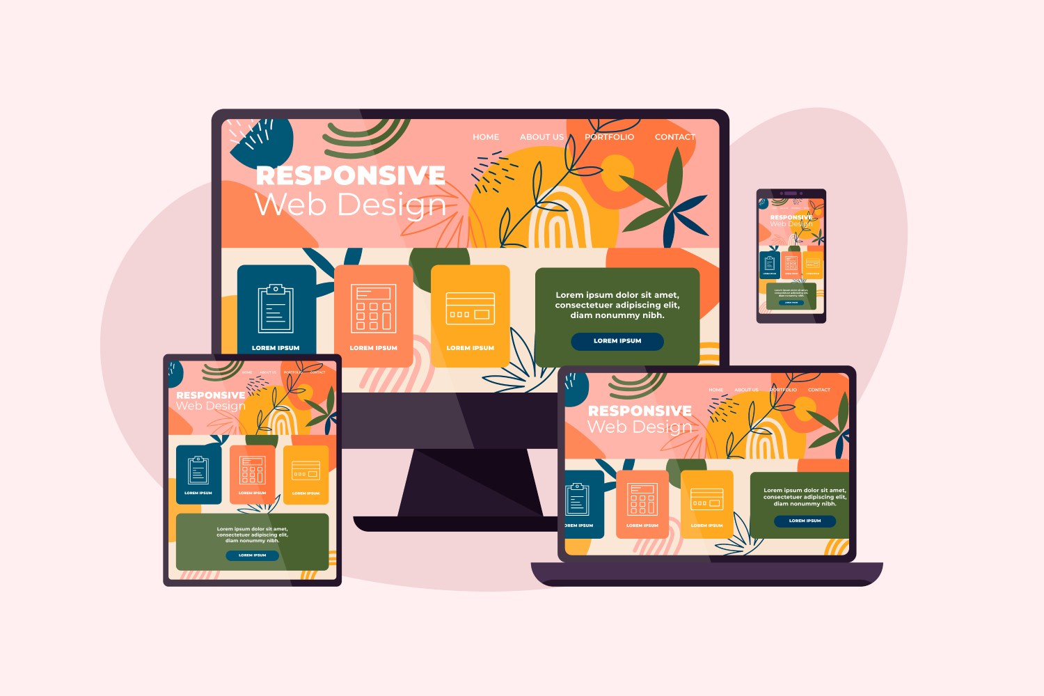
Mobile-first design flips the old method on its head. Rather than adapting a desktop site to smaller screens, it begins with mobile in mind. Every element, from layout to navigation to functionality, is designed first for the small screen. Only after that is the design expanded to suit tablets and desktops.
This approach ensures that users on smartphones get a focused, intuitive experience from the start. It’s not just about making a site look good on a phone. It’s about understanding how users interact with content on smaller devices and building with those behaviors in mind.
What Makes a Site Truly Mobile-Optimised
A mobile-optimised website goes beyond stacking and resizing. It introduces features that truly enhance usability:
- Interactive carousels: Instead of long columns, users can swipe between content sections with ease.
- Touch-friendly navigation: Menus, buttons, and sliders are designed to be easy and comfortable to tap.
- Smart animations: Subtle movements and transitions guide users through the content smoothly.
These enhancements reduce friction and help users get where they need to go quickly. It’s a user-first mindset that prioritizes engagement and satisfaction.
Frameworks vs. Flexibility
Tools like Bootstrap and Tailwind CSS have been widely used to implement responsive design. While they offer convenience and consistency, they can sometimes result in cookie-cutter websites. Many off-the-shelf templates follow a formula that limits creativity and fails to reflect a brand’s unique personality.
On the other hand, custom mobile-first design provides greater flexibility. By building from the ground up, designers can create tailored experiences that feel modern, intuitive, and on-brand. This level of control allows businesses to truly connect with their audience.
So, Is Responsive Web Design Still Relevant in 2025?
The answer is yes, but with a big caveat. Responsive design is still a necessary foundation for any modern website. However, the old practice of simply adjusting a desktop layout for smaller screens is no longer enough.
What really matters now is mobile-first, user-centered design. This approach ensures that your website performs flawlessly across all devices, with a particular focus on mobile usability. As mobile continues to dominate, embracing this shift is not just recommended, it is essential.
Final Thoughts
If your website still relies on outdated responsive methods, it may be time for a redesign. Prioritizing mobile users and designing with their needs at the forefront will keep your site competitive, engaging, and relevant in 2025 and beyond.
Whether you’re starting from scratch or refreshing an existing site, aim for a design that feels fast, fluid, and intuitive—no matter the screen size. Your users will thank you, and your conversion rates just might too.