

The goal of product pages is to showcase a product for a prospective customer with the aim to convert and make a sale. The pages are designed to display products like dresses, shoes and washing machines and make it attractive enough to convince shoppers who call at our online store that it is what they want and give them reasons to buy from our store.
At this stage, it is essential to enhance the visuals of the product for the shopper to select it without doubts for the carts. If visitors experience difficulty in using your product, it will be hard to convert and make the sale.
How do you capture users’ attention on your product page? There are three ways to make your store a sales magnet for effective sales.
Guide shoppers’ eye using contrast
An excellent method to lead users’ eyes your desired product is by using contrast in your design. Contrast differentiates between pixels using color or brightness variation. The following designs are examples of contrasting effects as displayed in figures 1 & 2 below:


You will find that a similar layout with the same content and product but different designs. In the designs, the products are positioned at different locations one at the bottom and the other in the middle while the CTA and the price are placed on the right of the design. On sighting, it looks nothing remarkable has happened, but it can convey varying degree of viewing experiences for the users.
One way to know how your designs will be seen is to use an AI called EveQuant to forecast how users will see the designs at first sight when they arrive on your page. We will examine two perception maps below showing the content that is prominent and displays the attraction area as indicated by the red circles; see images 1 & 2 below.


The product 1, page designer did a great job utilizing contrast most efficiently to pull the users’ eyes to the product features, CTA and the value proposition all in one sweep. All these make it easy for users to click on the product and head to the cart.
The same cannot be said for product 2, page designer as for product 1. The design has low contrast going right and this result in less emphasis on the product. The poor contrasting job brings other elements like headline come forward instead of the product. We can correct this by slightly tweaking the right bar either by changing the price or the “call t action” color to be more eye catching.
Eliminate possible distracters
It is important to understand that attention is a limited action – this means not so many visitors to a product page can see immediately they land on your page. However, some product pages still undergo confusion with so much content competing for the users’ attention.
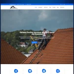
In the product page below, the designer added a promotional banner for 30% reduction for some items in an unrelated product display.


We can immediately see two contradicting scenarios: one being product information distraction including price and color selection. This will lead users to struggle with how to proceed to the sales cart. The second is that available space for the CTA is consumed and makes it almost invisible.
We can use our knowledge of distractions above to tweak the product page for better visibility and enhance sale by making it easier for users to proceed to the next stage of the selling process by removing the distractions. With that done, the perception map is now improved.

Since we removed all content distracting the users, the essential elements in the product page now have the desired attention from the users. The price and CTA now have users’ attention to acting on the product.
Making the most of the high value real estate
Studies with hundreds of subjects on eye-tracking effect on products indicate certain areas of the screen have higher chances of being seen at first sight. In the next image, it shows the parts, with the tendency to pull more attention, everything being equal.

This is so because the majority of users grew up reading from left to right, as such the majority expects valuable information in the area. But most online product page designs disregard this vital info. Let’s look at the following eShop’s product design for example.
It follows typical product presentation just like most product pages. When we reflect on the high-value areas of the designed image we know what to expect already. In our attention heat-map, we can see areas that attract the most or least attention as shown in the next image.


As you know, it’s the middle and top left areas getting the most attention. Other areas are getting next to nothing attention from the users because of their position in the design. You can turn around the result by tweaking the design and apply the attention getting recommendations discussed earlier.
To tweak this design, we can do the following:
- Add contrast. The size selection button need adding contrast to increase visibility
- De-clutter. Remove unnecessary product description to give prominence to the main information
- Make use of high-value real estate. Flip the design layout to enhance its high-value real estate
The next image shows the outcome of the tweak we just did. When we check through the attention heat-map, we can see a better users’ attention than before.


We have brought out the relevant content that makes it easier for users to act. The design cue in the users on what next to do without confusion and this helps them reach the cart and check out for more sales.
The lessons learned:
- Use your knowledge of contrast to lure users’ eye to your most valuable content like the CTA and Price. It is a mistake to focus your attention on something else.
- Give prominence to what the users want to see in the buying process and not what you think. Make your design clear and focused.
- Location is important. Use the attention heat map to locate your product where it will get the most attention from the users, and that is the middle and top left areas.